
How Professional Label Design Turns a Protein Shake into a Best-Selling Product
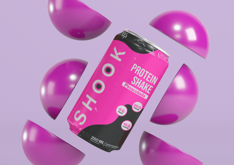
The vibrant and energetic design of Shook Protein Shake conveys a sense of freedom of movement, a modern approach to wellness, and a bold personality. The contrasting colors and dynamic elements highlight the product’s uniqueness and youthful character.
*The discount is valid for the first order.
💥 How Bold Label Design Helps Your Protein Shake Stand Out on the Shelf
In the world of health and fitness, having a great product isn’t enough—your product label needs to work just as hard as your formula.
At Solvela Digital, we create high-conversion visuals that turn glances into purchases, and our latest project for SHOOK Protein Shake is a perfect example.
🎯 Why Label Design Matters for Health and Fitness Products
From protein shakes to supplements, fitness products are stacked side by side on retail shelves and e-commerce sites.
What makes one stand out? A bold, eye-catching label.
The SHOOK label wasn’t just about aesthetics—it had to clearly communicate:
Flavor (Pina Colada)
Benefits (20g protein, 0g sugar, 10g vitamins)
Target audience (young, health-conscious, energetic individuals)
💡 According to industry research, well-designed packaging can increase consumer interest by over 30% and dramatically improve product recall.
🚀 Designed for Conversion, Not Just for Looks
Unlike generic templates or cheap Fiverr options, our process at Solvela Digital is strategic:
We conduct in-depth market research
We analyze your competitors
We create packaging that reflects your brand story and unique value proposition
For SHOOK, this meant designing a label that looks trendy and premium, with a layout that pops on TikTok, Instagram, and in fridge aisles.
🚀 Ready to Get Noticed?
Your product deserves more than a generic look.
If you want visuals that sell your story and significantly boost your conversions, let Solvela Digital create labels that stop the scroll and lift your sales.
*The discount is valid for the first order.
Subscribe to our newsletter


info@solveladigital.com
Solveladigital, MB
Business code: 306816045
Address: Liepų g. 83, LT-92195 Klaipėda